Color contrast is useful for packaging design appearance
Article author:拓客科技 人气:Issuing time:2020-02-11 18:35
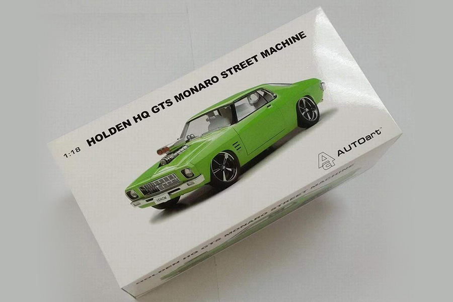
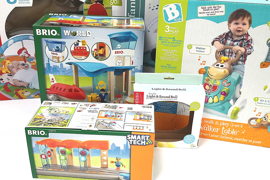
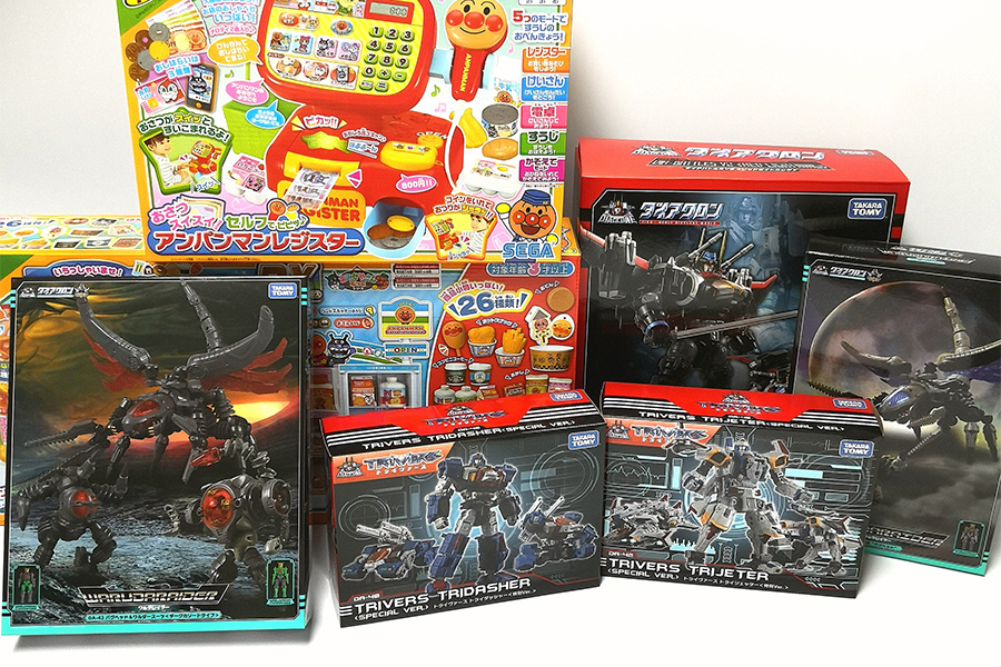
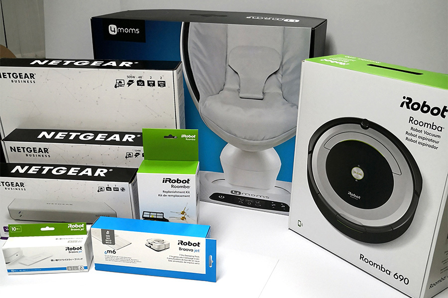
The color is different from different angles for different products. Beautiful colors are still useful for the appearance of packaging design. The purity of the color also needs to be tinted from a professional perspective, like the colors of warm and cold colors. Harmonization has its own requirements. This also needs to take into account the product attributes of the packaging design. Different products have different color contrasts. This depends on the product's attributes to adjust the color, regardless of the warm and cold colors. Contrast adjustment, to match the color of the product screen according to different packaging design needs. Looking at colors on different materials must also meet the material requirements of packaging design. The main part of vision still needs color to convey. The contrast of colors is useful for the appearance of packaging design. It is necessary to consider that the overall mix should conform to the product Requirements for color design.
上一篇:Tips for customizing the size of the box
下一篇:没有了
Keywords in this article:Color,contrast,useful,for,pack
Ranking of similar articles
- Printing Tips
- How to choose the printing met
- Tips for customizing the size
- Color contrast is useful for p


